Well after many weeks of working on the Civ2 episode of my big Civ video series and feeding in all the best scenarios and mods I've found or rescued over the last couple of years it's finally in a near finished position ready to have the final stuff inserted about my own scenarios...
So of course for that I actually need to friggin actually finish my scenarios lol.. so yes the time has finally come that I'm back working on my scenario projects and intend to get them all finished and released over the coming months if all goes well! The first one I want to finish is the biggest of them all, this Heroes of Might & Magic 2 scenario that MetroPolis and I started all the way back in 2019! One of the advantages of the 3 year delay is that I've learned a lot more about Civ2 modding allowing me to do some of the crazy stuff I posted in the previous dev diary and also look at better ways of redoing some of our old stuff. Starting with GUI and all the backgrounds! All of the old backgrounds I did were painstakingly edited down in quality to fit in the tiny original Civ2 dll files using GifX to keep things compatible with pre-MGE versions of Civ2. However next to no one plays those old versions anymore and some of our recent additions have broken support for them anyway. Civ2 MGE supports much bigger files in it's DLLs so we can do a way better job! Now don't get me wrong, I put a huge amount of work into carefully downsizing and colour reducing all those original background images but let's be honest, they didn't look good, so I've thought for years about redoing them. I also recently discovered how to do custom font colours in Civ2 which requires new colour palettes applied to all backgrounds so if I've gotta edit all the files anyway I may as well redo them!
To get things started I applied new custom font colours giving the primary and secondary headings a bright slightly golden yellow (similar to many HoMM2 GUI titles) ensuring they don't get as lost in our leafy marble HoMM2 GUI as much as the old grey ones did, I was going to make the regular info text bright too but that had some unwanted side effects, so I instead made it darker.
Secondly thanks to these new custom font colours, I was able to finally import the true HoMM2 brown GUI background (albeit a bit lighter still). For those who may wish to stick with the old cream one I've left it in a safe unused spot in the Icons file though.
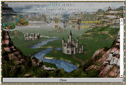
Thirdly I decided to take on the city backgrounds as while they didn't suffer the dll limitation issues I still used rather simple conversion techniques resulting a huge amounts of colour and detail loss. So all city backgrounds have been redone too!
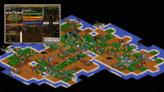
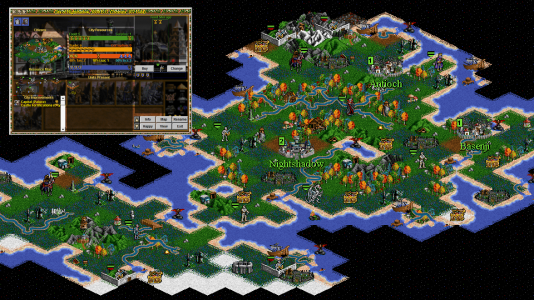
To demonstrate all these changes below is an old marketing shot I made up that shows some of the map, the GUI, a custom wonder video, the title and the city screen. You can see the old cream GUI window background, our headings getting lost in the marble leaves, and the lack of colour in the city background.
(Click to expand)
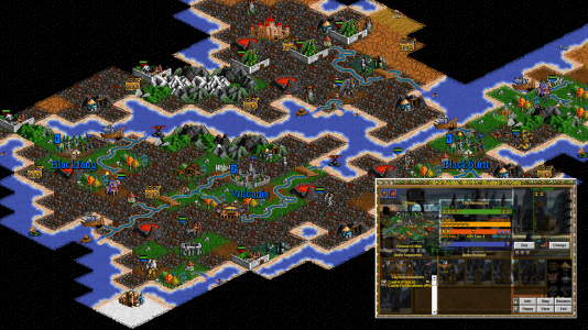
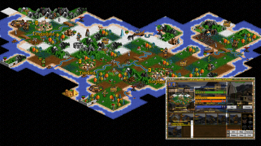
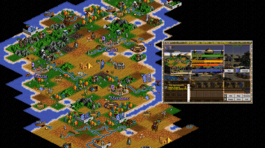
And here's a brand new shot where you can see the true brown HoMM2 GUI window background, bright coloured headings for the city and map windows, and the city background has much more colour in it. As a fun side effect the custom yellow font colour has also changed the city building list and the flashing end of turn message!
(Click to expand)
Next I started looking at Civ2's Intro.dll file to get things looking better in the main menu/title screen. Our original background was not good as the default Civ2 background lady statue with the scales etc was all brown making the file size so small forcing me to spend hours gradually taking so much detail and colour variety out of our custom background to fit in the dll that it just looked terrible! Plus its lack of quality was made even more obvious by the fact that Metropolis had crafted a beautiful custom intro video using this castle on the lake sequence and the transition between the two was quite jarring due to the huge quality difference!
(Click to expand)
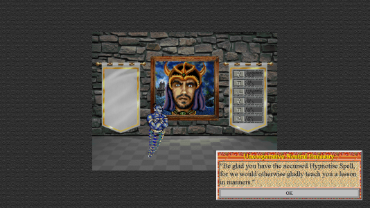
I also didn't know until I discovered Matt Dempsey's Game of Thrones scenario that you could put giant images on the Civ2 title screen and they would still nicely stay centered even if you're viewing resolution is smaller than the picture. So knowing that I not only created a better version of the HoMM2 castle title image (that looks similar to how it looks in Metro's intro video) but I also mounted it on a giant 1080P background image using the HoMM2 addon title screen image of the dark moody sunset battlefield. Naturally I've also gone through all the extra window image backgrounds that appear as you start a new game and redone them in much higher quality so you'll also notice the cobblestone street village image on the top left is also much better too! And of course the custom fonts and new GUI background are in play here now too!
(Click to expand)
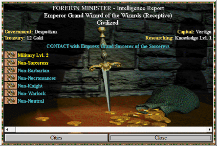
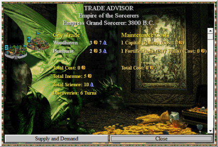
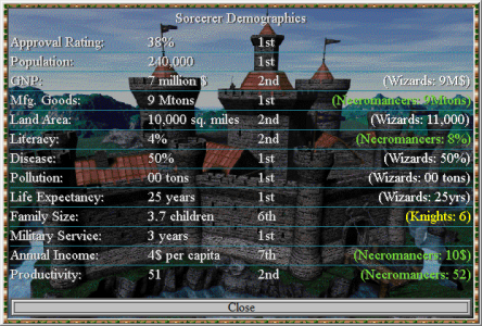
I then commenced upgrading all the advisor background images now that I'm free of the GifX pre-MGE leash on Civ2 dll image sizes. Previously we used fading and blurring whereas this time I simply used darkening on all images just enough to make the text in front of them still readable (yes I know I probably should have gone even darker but they're sooooo pretty lol).
As you can see things are looking much nicer now!
Old
New
Old
New
Old
New
Old
New
Old
New
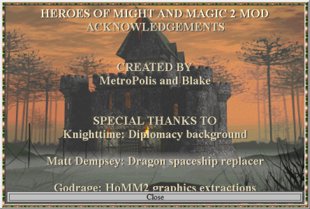
I also decided that since we're already using HoMM2 Castle screen pictures for our city background images that we didn't really need to continue using them again in all those advisor backgrounds so I decided to boot up Heroes of Might & Magic 2 and take brand new screenshots of it's good old cutscenes to make new background images for many of the advisor screens! I also noticed that we never replaced the old Civ2 credits screen either so I changed the background and text for that too.
(Click to expand)
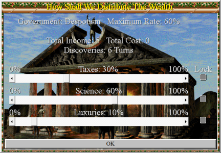
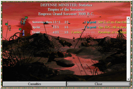
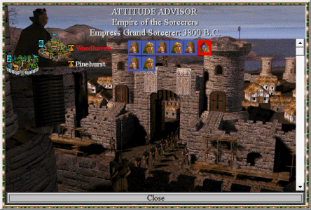
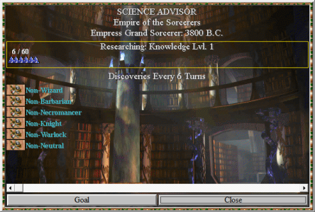
I also found where Civ2 keeps that little miniature icon version of its main menu title image (lady with the scales) that appears on the start a new game and quitting windows. It's very small so I couldn't think of anything good from HoMM to put there, so for now I just stuck a Black Dragon & Crusader from our units file in there squaring off heh.
And lastly I successfully converted all the city sky view screen image files in the CV.dll file to support the custom fonts palette which stopped it cancelling out the custom fonts everywhere else whenever you looked at your cities. The city sky view itself doesn't look any different to what you've seen us post before though other than the city name being golden yellow and more obvious now.
That's it with the overhaul for now.. next I'm thinking about replacing Matt Dempsey's custom dragon breeding screen that we used to replace the Civ2 spaceship launch sequence in my previous post. His dragon is cool but it's not from HoMM and it needs to be a special dragon different from the regular dragons you can build as units in the game so I'm cooking up something fun and interesting I'll show you guys next time!
After that all that will be left to do is designing a cool map for the scenario, test playing it and then we can finally release this thing!




 Zitieren
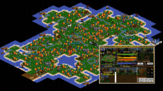
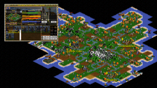
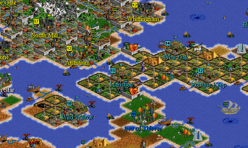
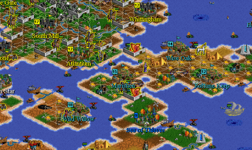


 (I would have expected Undead on Plains)

